AWS Customer Service Worldwide Operations. This is a group of leaders (site leaders, operations managers, customer service managers) who collaborates with other Amazon Web Services departments, such as training, to come up with different initiatives to improve the customer experience.
Problem
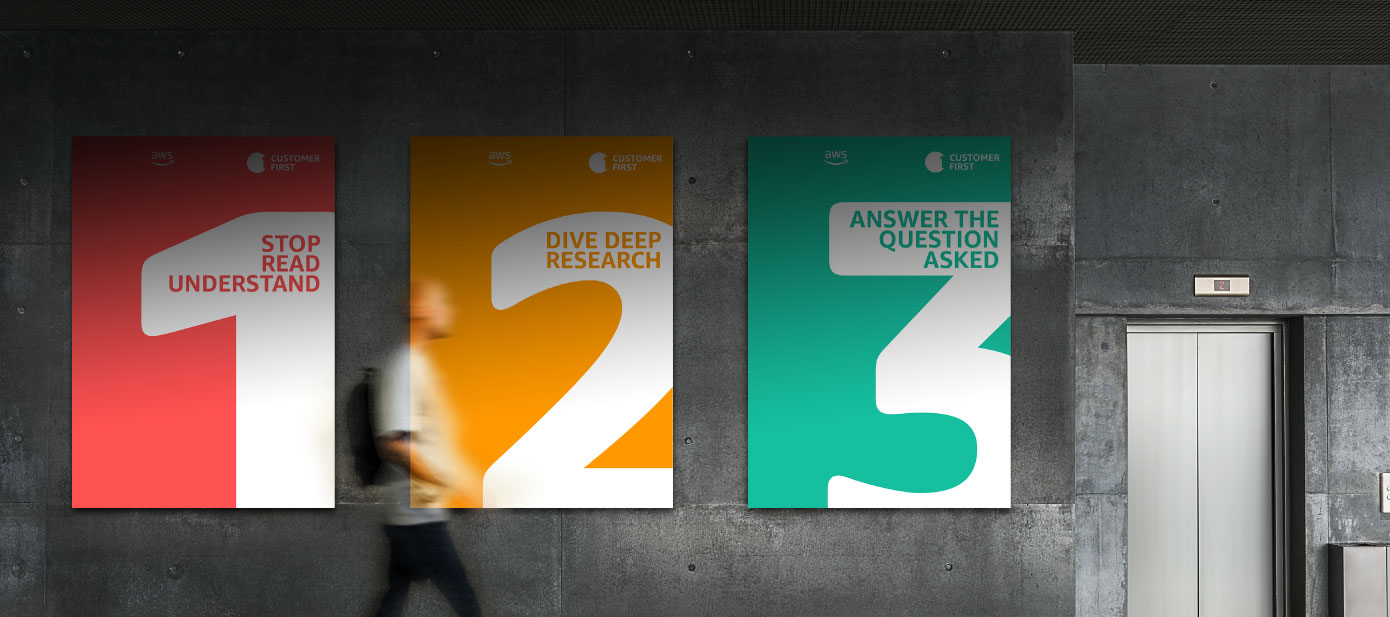
They needed to launch a learning campaign called “customer first”, and they needed a graphic element that would identify this initiative and that would make it easy to differentiate from others.
Solution
Following the Amazon branding guidelines, we designed a logo that represented the main concept they were trying to transmit.
Results
As a result, AWS customer service associates received a campaign that was easy for them to identify where it was coming from. This campaign was a series of banners and e-mails that taught them different principles to improve the experience of the customer. Now these Ops Managers have a complete bank of cohesive visual assets that they can use next year, which will save them more time and effort.
Challenges
The main challenge here was the time. We were contacted because they needed urgently this logo, since they needed to launch this campaign in 3 days. We usually don’t accept work with such a short deadline, but since they mentioned the name of the campaign we had a clear idea of what the logo could be. We had the work completed in 48 hours, which is something pretty remarkable.
Research
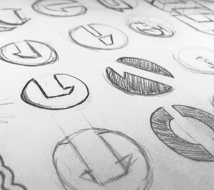
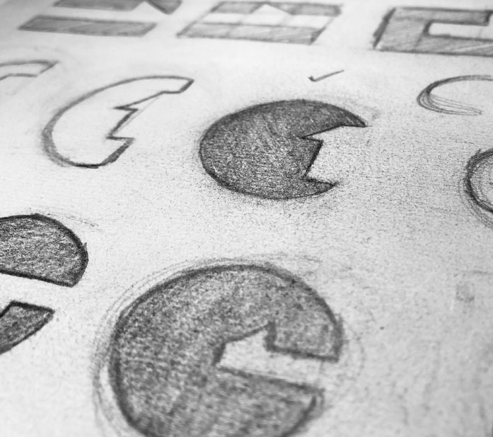
This is a logo that took us 48 hours to create. Due to the urgency we skipped most of the usual research and went straight to the sketching book with the idea that we already had in mind.
Sketching
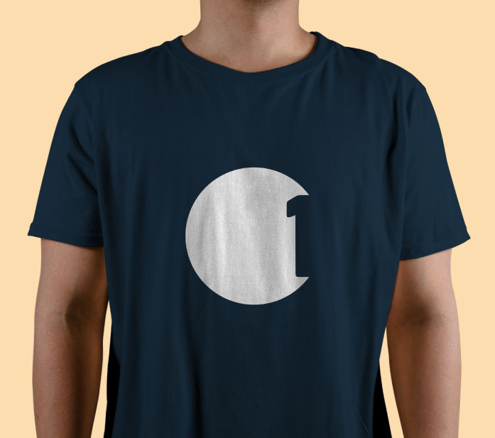
We started by exploring how the “C” from the word “Customer” could be mixed with the number “1” for “First”. Then we found a solid concept that we kept on exploring: How to translate in a composition that something has priority? How can we give priority to the customer? How can we give priority to the “C” vs the 1? We did that by carefully choosing the amount of space that is given to each one of those elements in the composition.
Logo construction
We used a circle and formed a “C” by subtracting the negative space that was formed by the number 1 in Ember font to keep the consistency.
The most important leadership principle in Amazon is Customer Obsession. This means that every decision is taken having the customer benefit first in mind. That’s what the phrase “Customer First” is trying to transmit.
To represent this level of priority, we gave the biggest amount of space to the letter “C”, leaving the “1” barely readable and just as an accessory.
This concept was also translated into the banners that were designed for the e-mail campaign. They have lots of negative space that represents the customer.
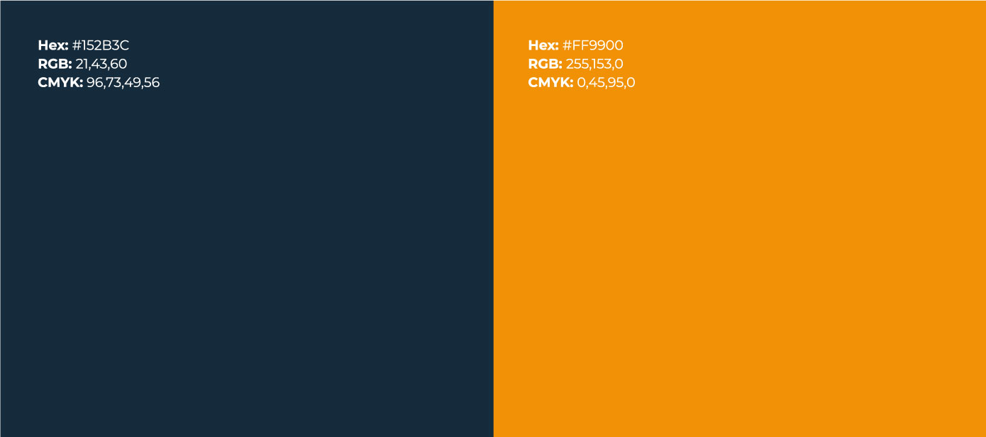
Colors
We used the Amazon orange to keep it branding compliant and also to express that this was part of Amazon.
Also, as per Amazon branding guidelines, we used the Ember Display Bold in Squid Ink color (depending on the background).