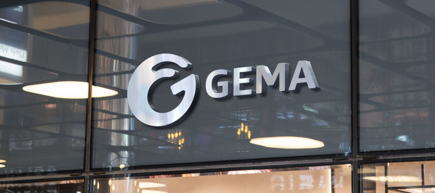
The Global Expansion, Mergers & Acquisitions team (GEMA) coordinates the growth of Amazon in the US and around the world.
Problem
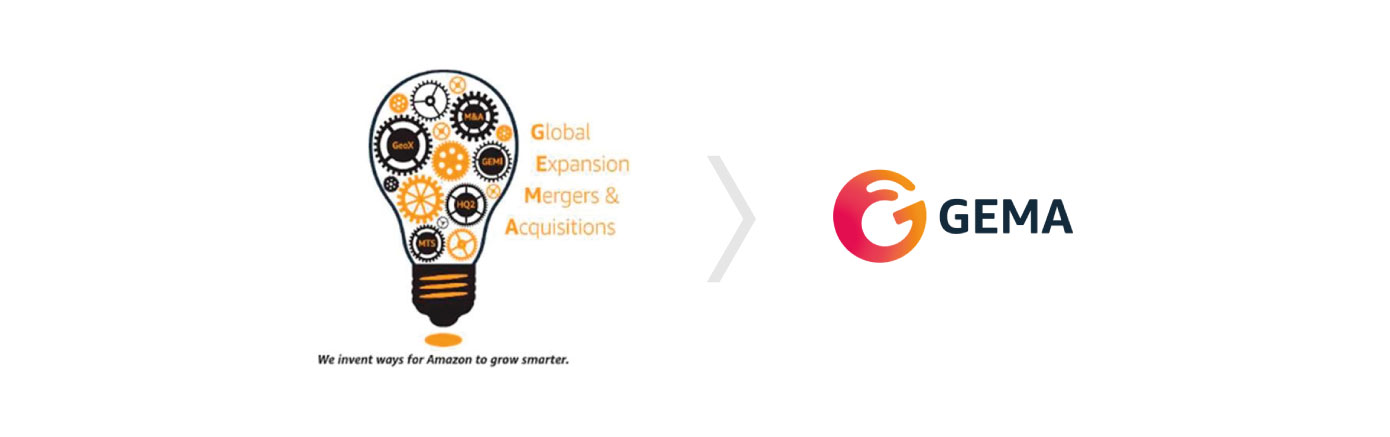
They had a logo that was outdated and didn’t represent their core values and what they do. Also, due to its complexity, it was difficult to implement in different applications.
Solution
We analyzed their core values and found ways to represent them in a new modern and minimalist logo while following the branding guidelines of Amazon.
Results
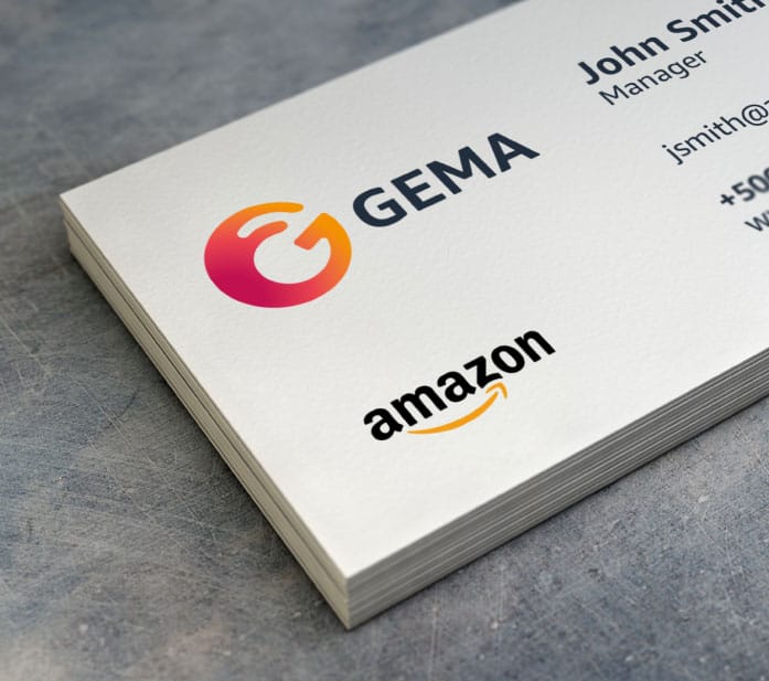
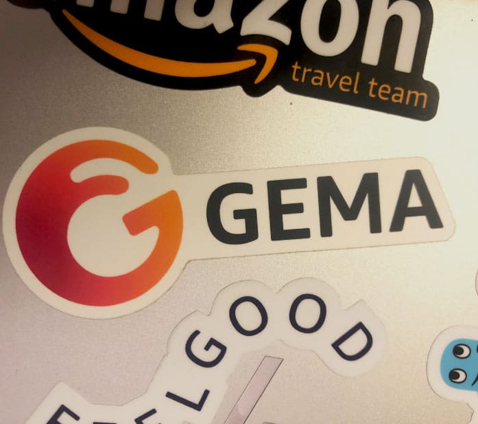
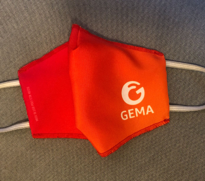
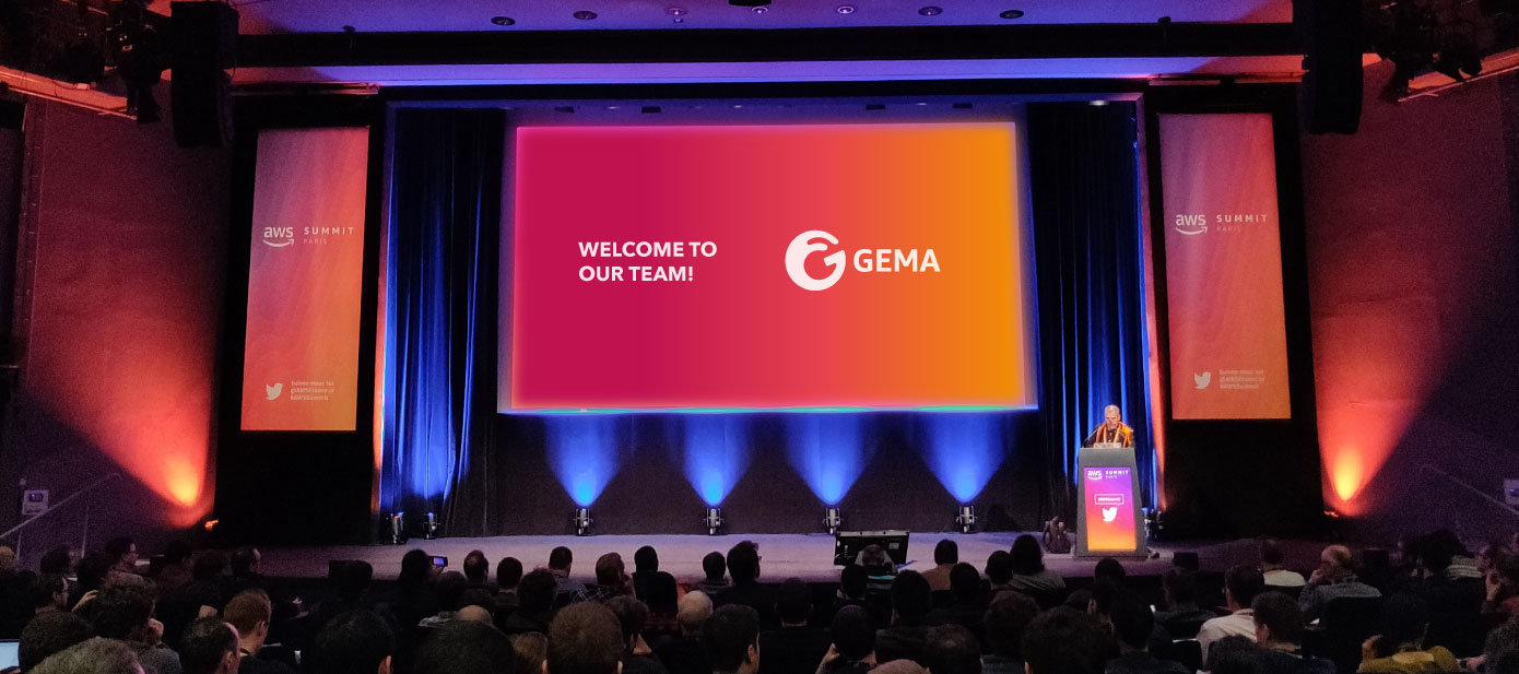
Now they have a logo that truly represents who they are as a team. This has been used as a tool for them to build their identity and their sense of belonging. Management has been able to create different applications such as stickers and facemasks which has increased team motivation.
“From researching the right colors and styles in the market, to a deep dive into GEMA’s logo history and current needs -he hit it out of the park! The logo is more than we could ever have imagined on our own. Alejandro’s guidance and expertise made approval with the branding team easy, too. We now have a logo we love that resonates with the values of the GEMA team. Thank you!”
Amber Wyss Amazon HR Executive Assistant
Challenges
They wanted to express about 12 different ideas with the logo. We were able to narrow them to 2 that best represented them: Amazon growth and global support. Also, the growth concept is usually best represented by an arrow going up, but according to the Amazon Branding Guidelines arrows should not be used since it is already present in their main logo and might create confusion.
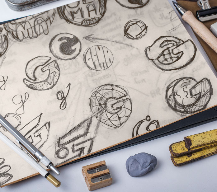
Research
Mind maps are one of the best ways to start our creative process because it allows us to have full clarity about all the information that we need to take into account. For GEMA it was a way to dissect the brief and the research into the main ideas and being able to come up with the two concepts that could summarize what they do.
We found that the best way to represent global support was by using a hand and a circle, but we were still not sure how not to use an arrow to represent growth.
During the sketching process, we found that the G had a hidden arrow that we have never seen before.
Sketching
For this project, we quickly arrived at an option that was made by abstracting as much as possible the combination of the hand, the circle (the world), and the arrow. The funny thing is that when we put all of those symbols together it formed the shape of a “G”.
The result was an icon that is simple, unique, and distinctive, with adequate use of the negative space, that can be used in any size, and most importantly, that represented their main identity components: global support and growth.
Logo construction
For the design of this logo in Illustrator we used basic geometric shapes like circles and rectangles, and strictly followed the Amazon branding guidelines for this purpose. We would have loved being able to show how those guidelines were followed but they are part of the confidential information were are not able to disclose.
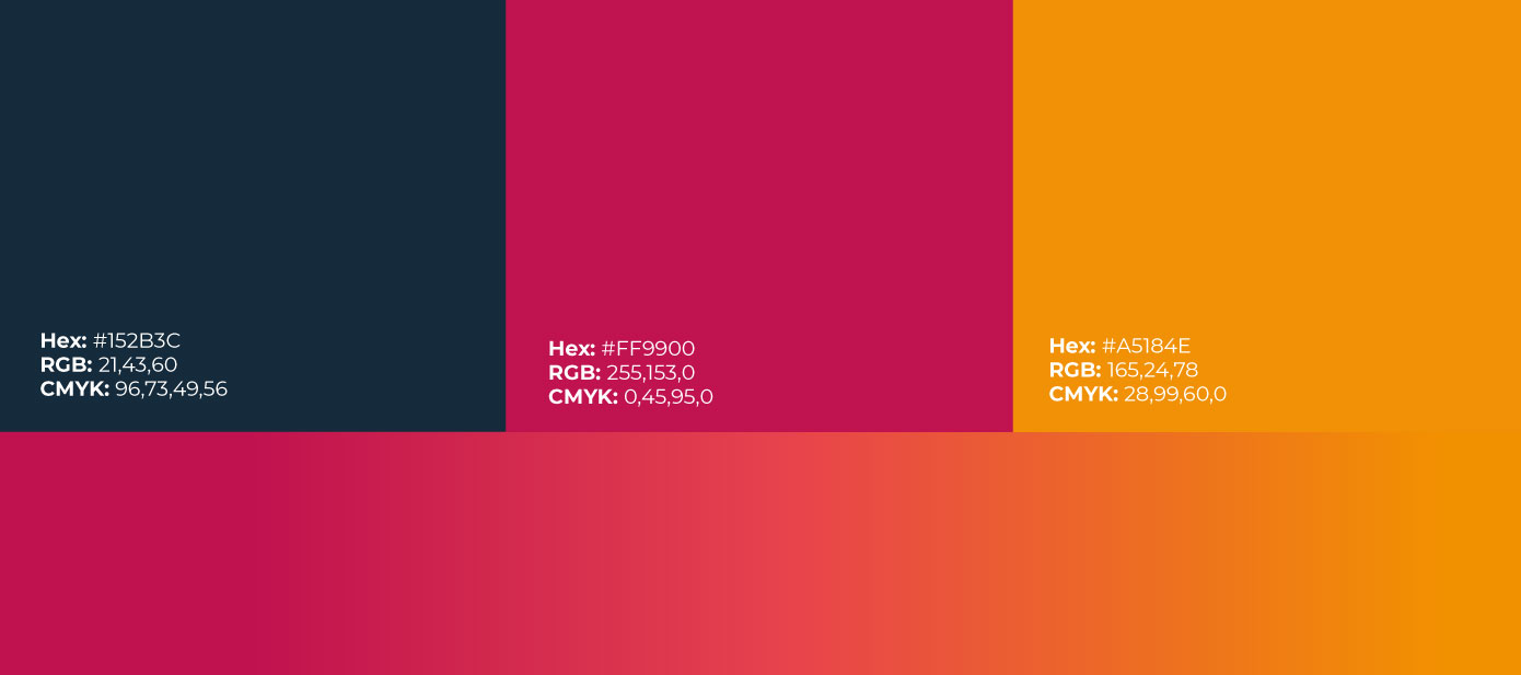
Colors
The way to connect this team logo to Amazon was by using the same orange color. And the way to transmit the idea of fresh and modern was by creating a gradient with a branding approved red color, that represents the passion this team has for what they do.