Sebastian Luca is a concept architect from Rumania. He and his team have been working for years creating fantastic architecture for video games and movies.
Problem
He has been a successful freelancer for many years and now he wants to grow, not only in the terms of his team but also in the quality of projects and clients he works with. In order for him to establish a better position in the market he needs to be perceived as a high-end studio, and not as a freelancer.
Solution
We had a discovery session where were clarified his brand strategy. Then, we created a visual identity from his DNA. This is a simple, modern and serious identity that gives him the high-end look and feel he was looking for.
Results
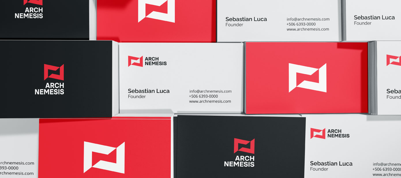
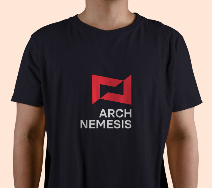
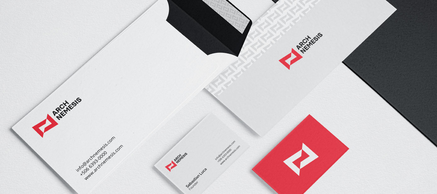
Sebastian has now a whole identity that will allow him to apply it on his new website and in all of his marketing efforts, and he is able now to earn the trust of his ideal clients. This identity represents his main brand attributes. Compared to his competition now his studio looks stronger and with more quality.
“They helped me adjust the initial brand strategy to communicate trust to my clients. Then they visually translated the company’s personality into branding, and successfully designed a high-end website for the brand. I was impressed to see how they were able to capture the spirit of the company into a logo. Amazing work!”
Sebastian Luca Founder of Archnemesis
Challenges
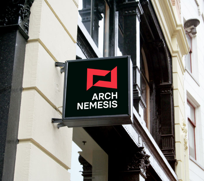
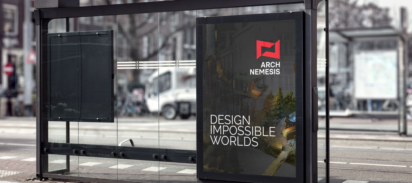
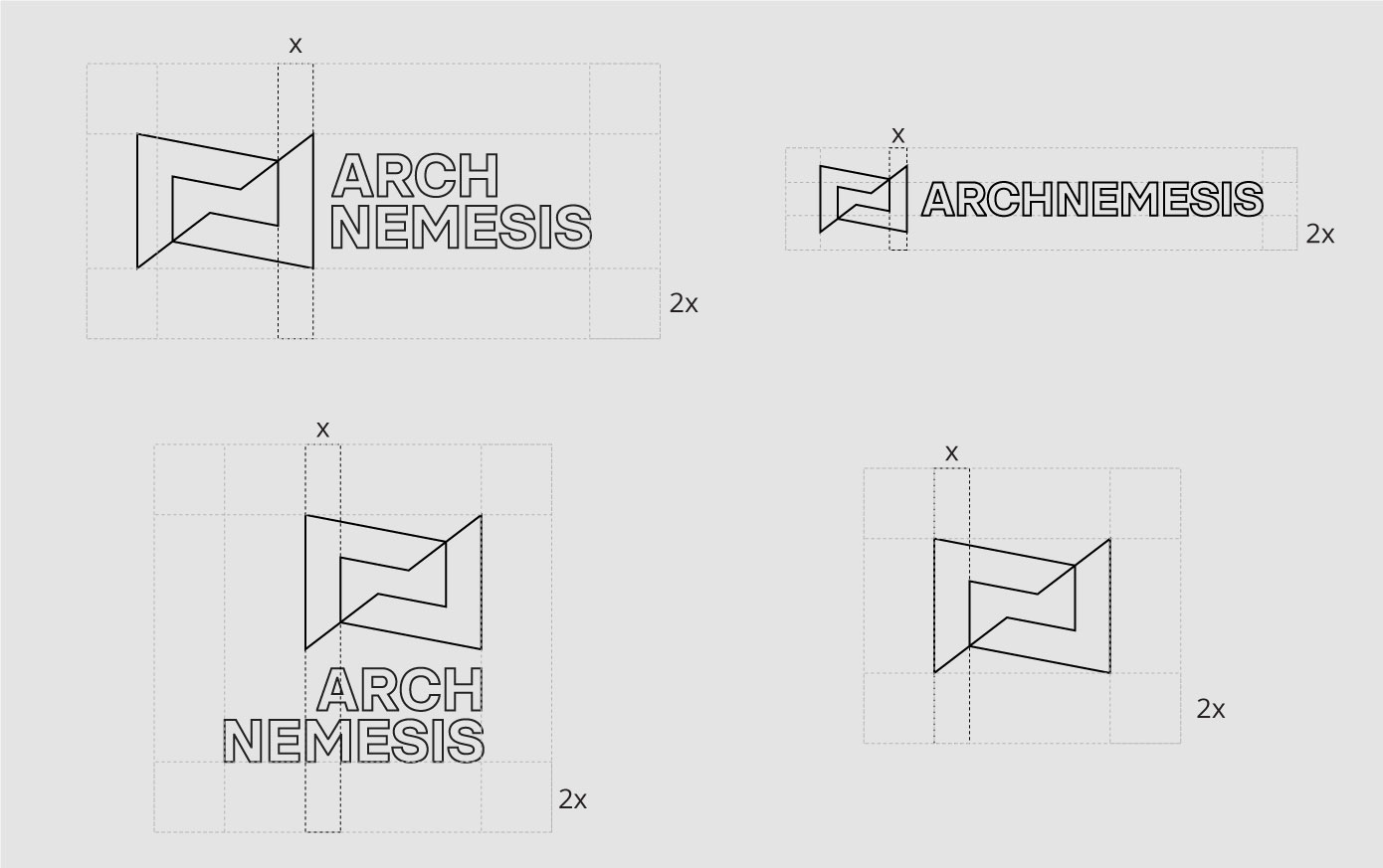
Archnemesis is a long name for a brand, and for that reason, we decided to split it into two parts and also use a symbol, so that the brand get’s positioned better within time.
The type of work that he creates looks natural, organic, architectural, and fantastic, but we couldn’t get inspiration from those attributes for the visual identity. It needed to be clean and minimalist, and at the same time authentic to fit the personality of the brand.
Research
From our discovery session we were able to nail down the main brand attributes:
reliable
high-end quality
efficient
And also the tone and personality
confident
serious
respectful
Stylescapes
Before we start designing anything for the brand, we need to define the look and feel that we will work with.
In this case, we presented the client with 4 different stylescapes that we put together based on the brand attributes that we extracted from the discovery session.
The client chose the first option. This would allow us to embrace the “evil” connotation of the name, instead of shying away from it. This works great in the industry they are in since this “evil” sense is taken as just part of the game.
We also decided to use a minimalist graphic style to keep the serious and professional vibe in spite of the high contrasting colors.
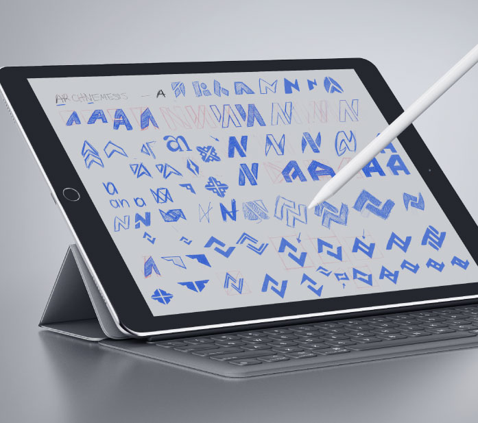
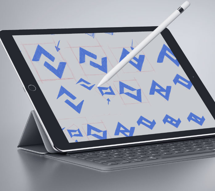
Sketching
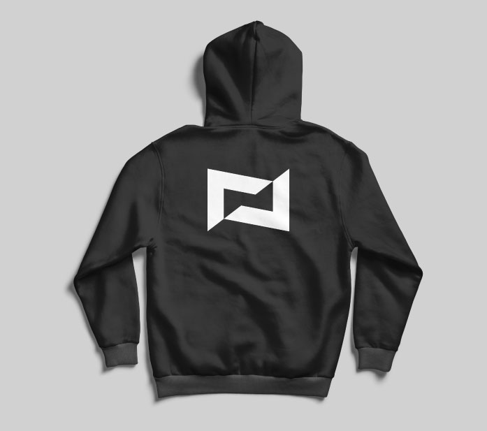
We explored many options, but when we felt like we were on the right direction was when we started to place the “A” and the “N” on top of each other. From there the iterations were focused on abstracting the union of those letters as much as possible. Until we arrived to a symbol that look solid. Using two abstract “A”s we were able to create an “N”. This is the type of clever symbols we like to create.
Logo construction
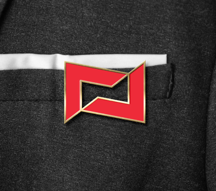
The logo starts with an “A” for the “Arch” part of the word “Archnemesis”. This graphic element has thick and strong lines to represent the reliability of the brand. It has sharp corners to match the “dangerous” connotation of the name of the brand. We rotate the “A” 37° to represent perspective, which is an element that we extract from the main service our brand offers: architecture.
When we add another “A” but in the opposite direction, we get an abstract “N’ for the “Nemesis” part of the word “Archnemesis”. These two shapes are arranged in such a way that creates the visual effect of being cut and moving in opposite directions.
In the negative space, we can find a ray, that represents the brand attribute of efficiency.
Colors
For the color palette of this brand we decided to not shy away from the “evil” connotation of the name, but instead embrace it.
Red and black have been used throughout history in horror movies and comics to represent the evil forces, the enemy. That’s why these two colors are appropriate for the brand, especially taking into account the industry where they are in which is video games and movies.
Typography
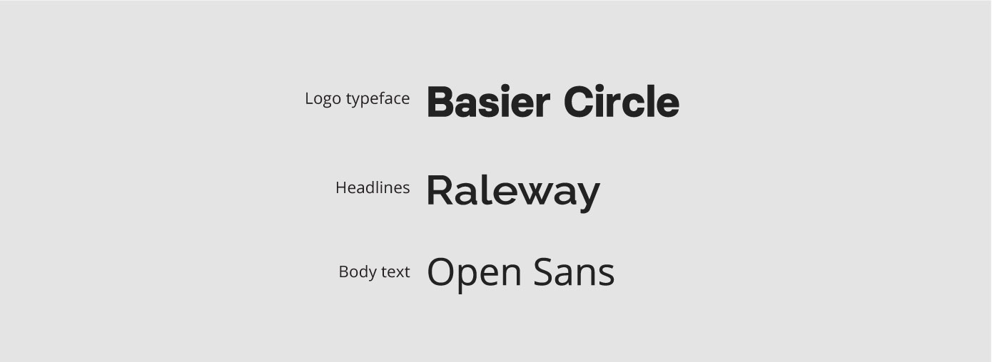
We chose Basier Circle for the logotype because it had some nice sharp edges especially in the “A”, “N”, and “M”, that connected with the logo, and at the same time it had some flat terminations in the “C” and the “S” that made it look solid and formal.
Then we needed a strong and formal-looking font for the titles and subtitles. That’s why we chose Raleway.
And finally, we needed a simple and minimalist typeface that would have great legibility and contrast with Raleway. That’s why we selected Open Sans.
These two last typefaces are Google Fonts, which makes it easier and faster for them to be used on the web.
Styleguide
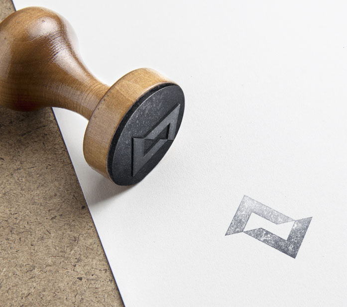
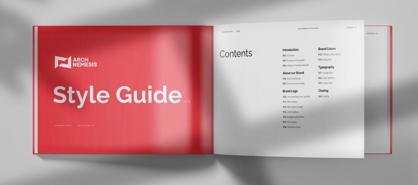
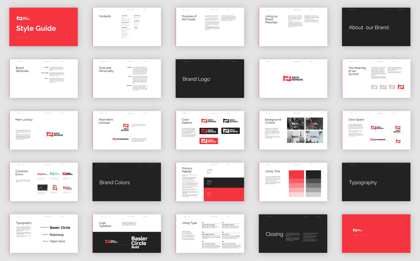
We created a Style Guide to always keep the brand consistent. The look and feel should remain the same regardless of the application so that their clients can recognize them from the competition.
Instead of creating strict rules hard to follow, this guide will give designers the basic elements for them to create a design that will consistently look like the brand.