Mauren Quirós is an independent Costa Rican lawyer that had recently opened her own office.
Problem
She is starting to offer legal services in a very crowded market. She needed a way to differentiate herself from the rest of lawyers and start generating new clients.
Solution
We had a workshop where we defined the brand strategy to have full clarity of what was the DNA we needed to project. Also, we designed a whole visual identity system inspired by the Bauhaus movement.
Results
Thanks to the brand strategy session she now has full clarity of who she is as a brand, and what is her ideal target audience, which has empowered her to define and execute her marketing strategy. She has been able to claim a place in the market with a unique visual identity that she is proud to use.
“For me having a visual identity as unique as this one has been incredibly important to show the world that I’m not just one more lawyer, I’m different and driven by a purpose of helping people. Also, the inspiration from the Bauhaus movement, and especially in the resilient women of the time, is a great way to tell people why I’m so different. I could not be happier with this work, thank you so much!
Mauren Quirós Attorney at law
Challenges
She wanted to differentiate herself from the rest of the competition. She didn’t want the typical balance scale logo that most lawyers have. She was looking for something modern and sophisticated, that would reflect the essence of who she is.
Also, she didn’t have enough clarity about her brand so that we could start the conceptualization stage of the visual identity design.
Research
As part of the brand strategy session, we were able to detect the main brand attributes:
Modern
Close
Trustworthy
Purpose-driven
Prestigious
Energetic
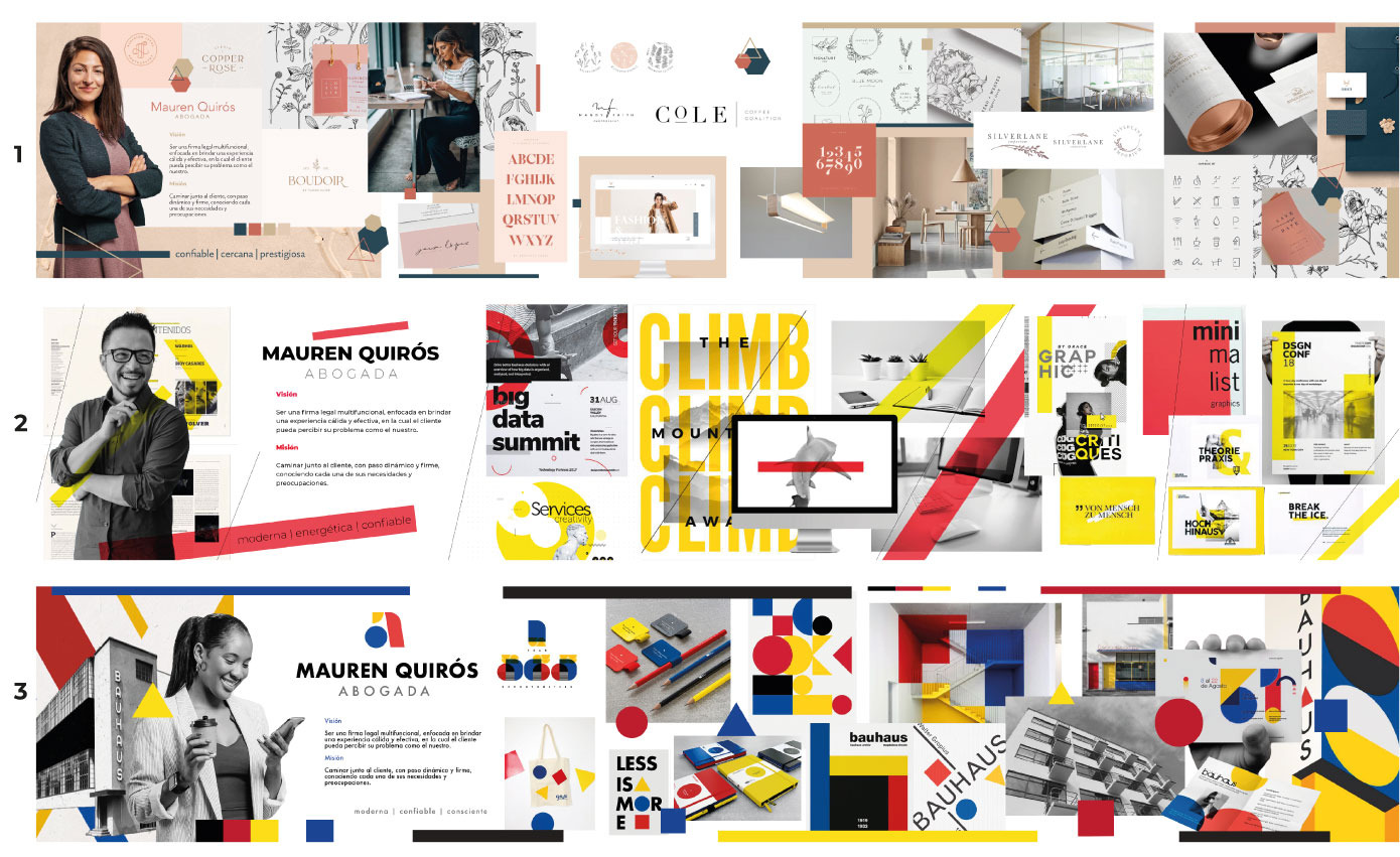
Stylescapes
Based on the brand attributes we designed 3 different stylescapes for Mauren to choose the visual direction of the whole brand identity system. In this case, she chose #3.
About the stylescape selected (#3)
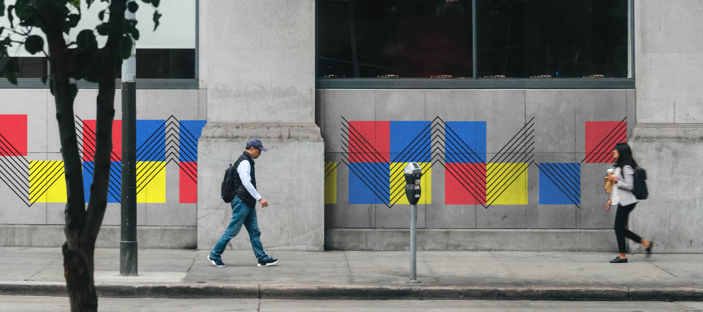
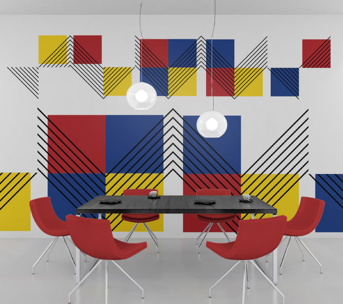
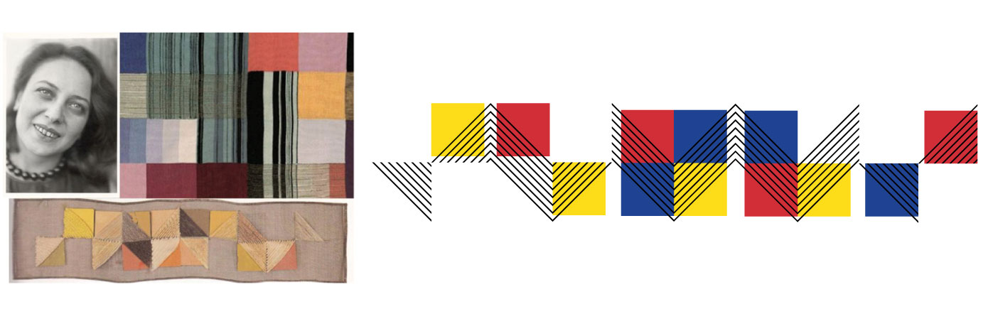
Bauhaus was a German art school that after it was closed in 1933 became a movement worldwide. Even though this school was considered progressive for allowing both men and women to study, only men were allowed to be architects, sculptors, and painters; women were only allowed into textile, weaving, and ceramic workshops. In spite of that, brave women like the Croatian designer Otti Berger (1898-1944) didn’t allow the circumstances to limit her, and expressed her art in the textiles, creating amazing pieces of art which she exhibited in her own gallery. This level of resilience definitely resonates with Mauren and the brand she wants to project. This style inspired in the Bauhaus focuses on the use of primary colors and basic geometric shapes.
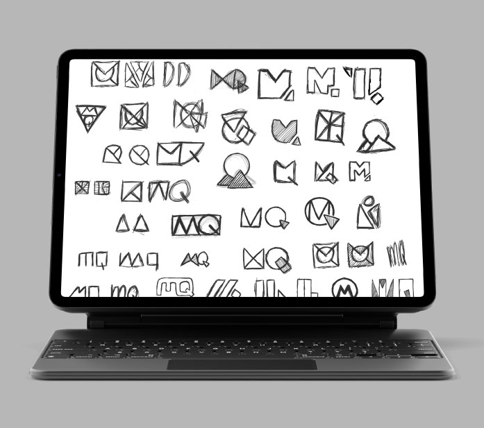
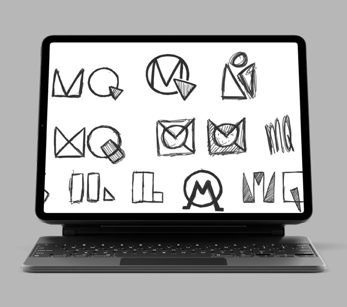
Sketching
Once the style was decided it became easier to start sketching because we knew that we needed something geometric and simple.
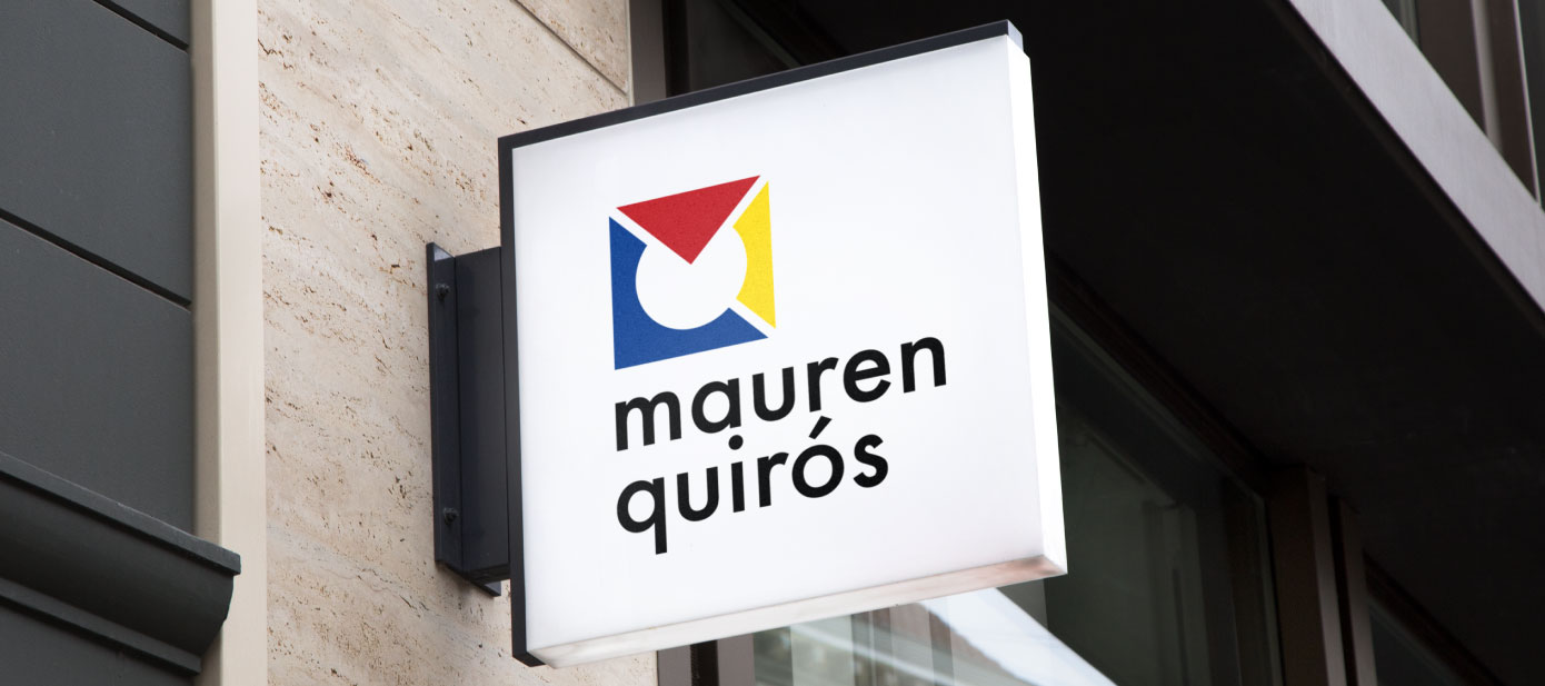
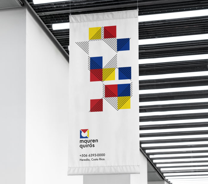
Logo construction
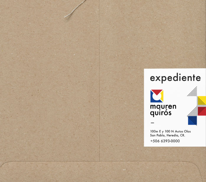
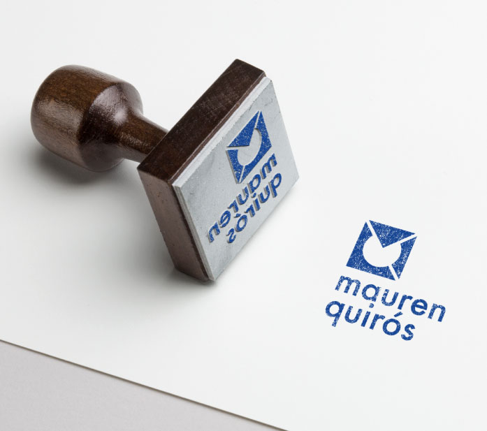
The symbol/monogram is built with the basic geometric shapes: triangle, square, and circle. Playing with the initials of Mauren Quirós to create an original symbol. Her name is written in lower case to project the strong, modern, and close attributes.
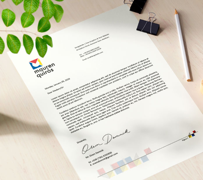
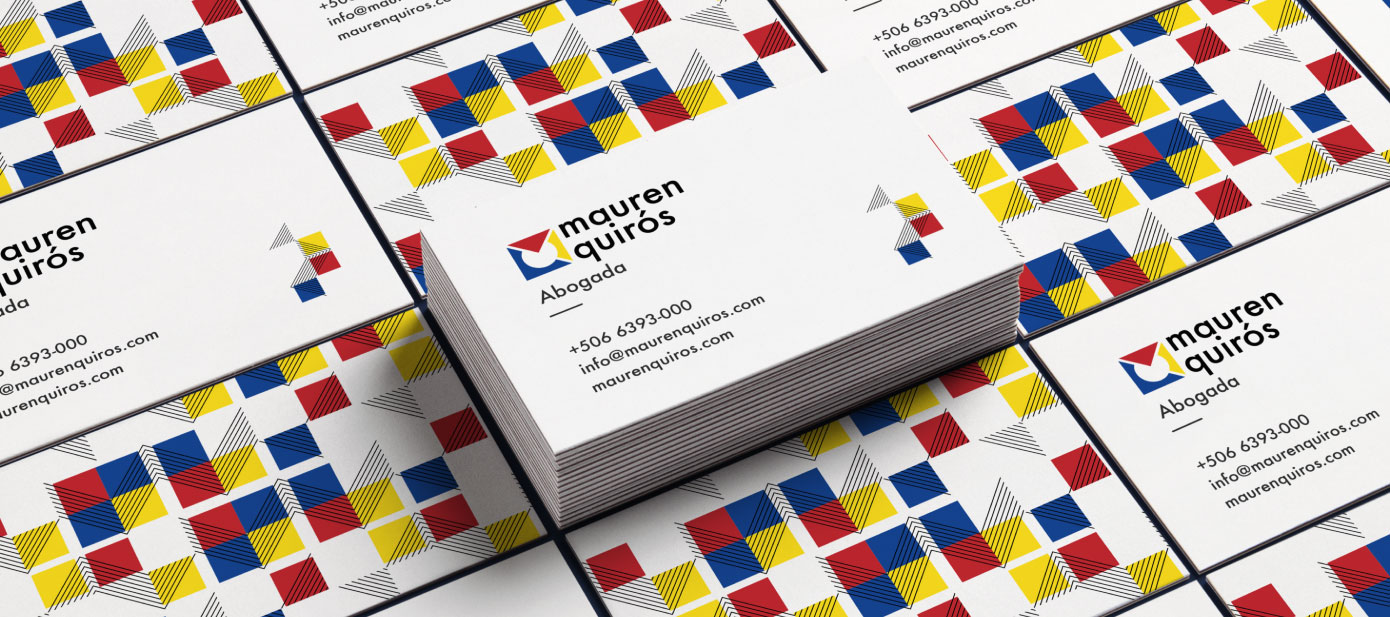
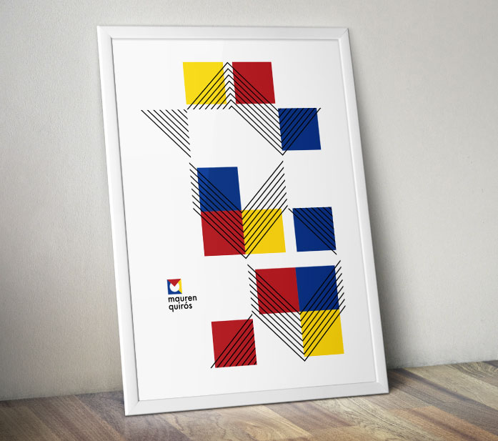
Pattern
Women from Bauhaus are a great inspiration since they overcame every obstacle men were putting to their potential. Otti Berger was one of the best examples of resilience, turning textiles into pieces of art. We took one of her famous designs and reimagined it into a modern pattern Mauren can use to bring consistency to her graphic communications.
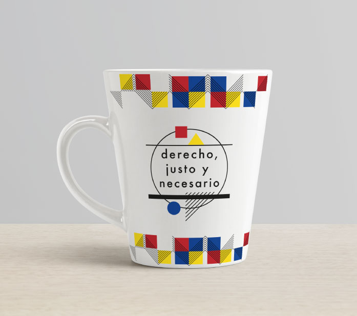
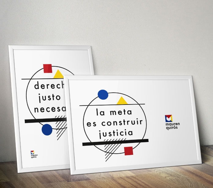
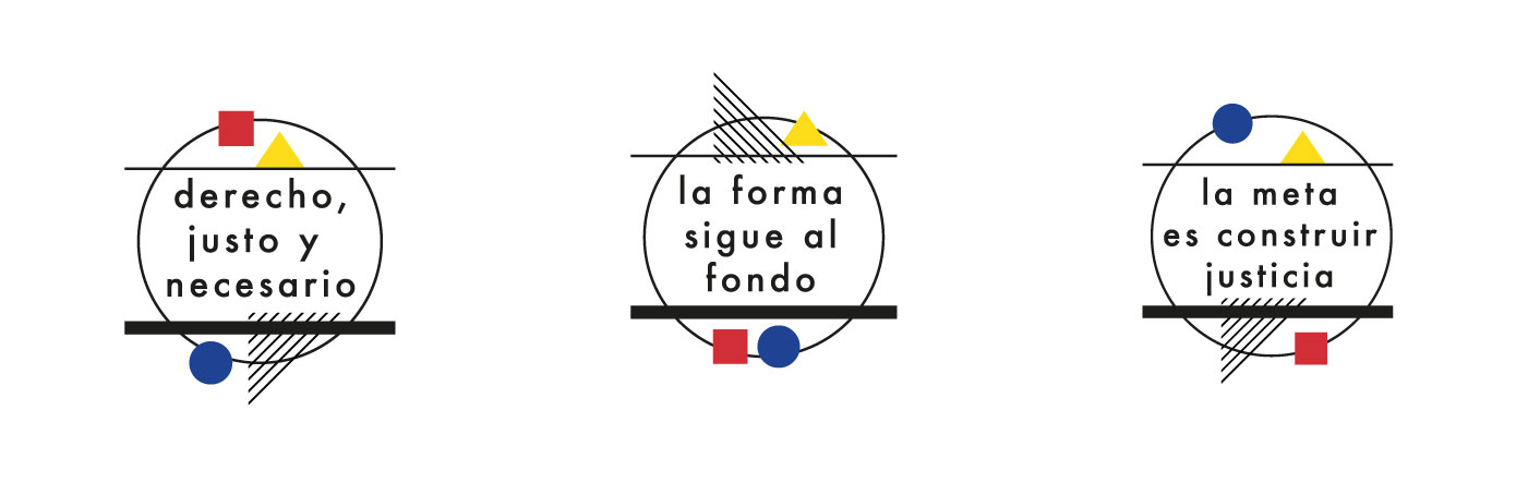
Typographic Seals
There are some famous phrases in the Bauhaus movement like “form follows function” that help better understand what it stands for. Using his background in law Alejandro was able to adapt some of those phrases to the legal services she provides. This will help her not only as a graphic resource but also as a conversation starter, which will give her the opportunity to tell the story of what her brand is all about.
“The needs of the people instead of the need of luxury” –»“derecho, justo y necesario” (law, fair and necessary): Highlight her legal services as a real need to get to justice vs an unnecessary luxury.
“form follows function” –» “la forma sigue al fondo” (form follows substance): Focuses on using the fastest and most effective way to satisfy the needs of her clients, without unnecessary processes that waste time and increase the cost.
“The ultimate goal of all artistic activity is building construction.” -» “la meta es construir justicia” (the goal is to build justice): The ultimate goal of the law is justice and not the pursuit of selfish purposes. Justice is being built at each stage of the process.
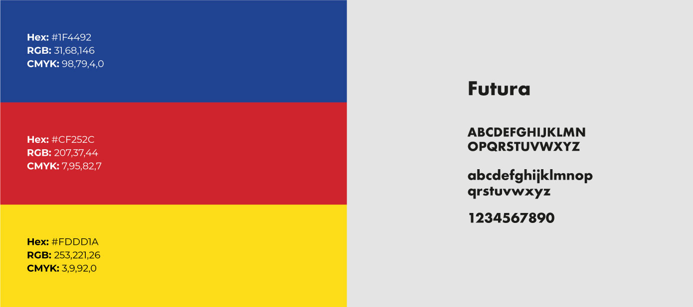
Colors
For this brand we are using the 3 primary colors inspired by the Bauhaus style.
Typography
For the logo, titles, and subtitles we’ll use Futura. This is a geometric san serif typeface designed by Paul Renner and released in 1927. It is inspired by the modern concepts of the Bauhaus. For regular paragraph text, we’ll use Calibri, an easy-to-read san serif typeface was designed by Luc de Groot in 2002–2004 and released to the general public in 2007, with Microsoft Office 2007 and Windows Vista.